Prototype testing send money feature of GCash
In-depth prototye testing of different money sending feature of GCash

RESEARCH OBJECTIVES
GCash team has come up with few design prototype for sending money on their platform using three ways- Express Send, Send to Many and GCash Padala.
The research objective was to evaluate specific nuances given below for each of these ways of sending money:
-
How users evaluate the three options, how much time do they take to transact for each?
-
How do they feel about the new design of send money? Do users actively check each and every tab and options available through out the journey?
-
Selecting recipient input: recent, contacts, QR, or manual typing of mobile number
-
Feedback on the optional clip
Cohort of Participants
-
Gender: Male & Female
-
Usership: GCash users
-
Age: 25 - 55 Years
-
Key Market: Philippines
-
Samples – 50
-
Test Device - Mobile test
RESEARCH METHODOLOGY
 SCREENING
Users were asked specific questions to qualify and identify the right target audience
![]() DEFINE TASK / EXECUTION
DEFINE TASK / EXECUTION
The tasks/objectives were defined for users to perform Users were asked to perform 1 tasks for the app in exploratory or guided mode
![]() FACIAL CODING, EYE TRACKING & SCREEN RECORDING
FACIAL CODING, EYE TRACKING & SCREEN RECORDING
AffectLab captured facial emotions, eye gaze, mouse scroll, mouse click and screen recording
![]() POST SURVEY
POST SURVEY
Users were asked specific questions about their experience in completing the task
INSIGHTS
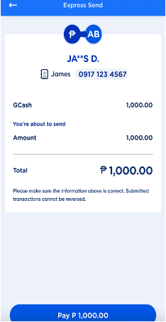
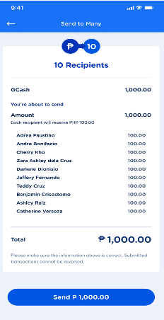
Time duration: users tend to spend more time on Send to Many task owing to higher appeal .
- Overall users spend less time performing the task which could be due to the non-static task page which sort of pushes users to click on “next” on the task page and quickly complete the transaction.
- The Transaction summary page does not seem to be working well, as users tend to spend little time on it as it delays the gratification derived from seeing transaction completion page
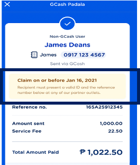
- Time spent on GCash Padala is not enough, for users to be able to comprehend the prompts, hence they may end up missing the claim alerts or miss going to the most convenient partner (from list of partners)
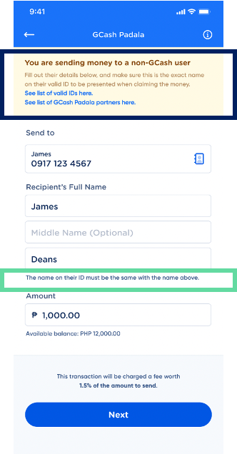
Contacts Icon: While on an average users did not register the icon; it is a good to have feature. The contact icon are not being registered by most users and hence, the time to discover is higher along with lower Earned attention. However, this does not hinder users’ journey as they perform the task by typing the name of the recipient in the “send to” bar.
Clips or Themes: tried by only 4% of users, was considered creative and expressive way of sending money
- “Add a clip or theme” option is currently getting missed by most users. This could be stemming from the task page not being static, hence, by the time “Add a clip or theme” option appears on the screen users may already be eager to click on the “next” button.
- Even after clicking, on the “Add a clip or theme” option users appear to not able to select between which to go for- a theme or a clip
Design Suggestions
Transaction summary page is not working; can be made more appealing if added as a prompt in the task page
- Users tend to spend little time on the transaction summary page this could be either due to low engagement for the user or as it delays the gratification derived from seeing transaction completion page.
- In order to improve this, some non-static elements on the page will drive up the appeal, and may result in higher time duration spent on the page
- Alternately overall layout can be made to appear different from the task page like we have for Transaction completion page- have a darker background. This will help in highlighting the content on the page even more and may lead to higher time duration spent on the page.
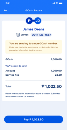
GCash Padala’s task page should highlight name on valid ID, claim alert as current prompts are not working
- “Valid IDs” is a mandatory step for successful transaction however, users tend to skip it which may lead to entering incorrect name of the recipient The prompt of “the name on their ID must be the same with the name above” under the “Recipient’s Full Name” bar can be in red and appear when the user begins to enter the name to ensure higher attention.
- Asses if list of partners more relevant for sender vs. recipient and if it’s needed here or placing it in the previous contact screen sufficient
- “Claim on or before __” (transaction completion page) prompt needs to placed before the transaction is completed hence, should be moved to task page where users tend to spend more time